hey FranCine
A Work in Progress UX Exploration and Creation for a New Beauty Website Experience.
Hey Francine is a new beauty experience with reviews, articles, and recommendations for their readers. They cover topics from health and wellness to makeup and fragrance. Hey Francine started on Instagram and gained many followers. On the instagram platform they have beautiful photography but limited space for articles. I was recruited to help create their web presence. We needed to decide the architecture of the site and what features would be offered.
RESEARCH
I started the research phase by interviewing the creators of Hey Francine. I wanted to know who they thought their users were and what sites inspired them. I also wanted to know what all they wanted to cover so I could architect the information in an easily accessible way. Then I reached out to some of their instagram followers to see what they loved about Hey Francine, what else they would like to see, and what other sites they looked at. Both the stakeholders and users agreed that this design should be "mobile first" and then translated into desktop. I took many notes with the stakeholders and users and then dove into analyzing the competition. The creators of Hey Francine needed a simple site but it needed to be differentiated from the other beauty blogs out there. We needed to figure out how to do that.
I looked at many different sites with different offerings. I decided the easiest way for me to show what was being offered by these popular blogs was to make a chart. I wanted to show the difference in topics covered, features offered, and also how these sites were being shared between friends and social media. After analyzing many different kinds of sites (beauty, wellness, personal, and medical) I looked back to see what the stakeholders and the users wanted from a blog.
This is the final chart comparing the topics, sharing methods, and features covered by six different popular sites.
Finding the Right offeringS
After reviewing the chart with the creators of Hey Francine we found our niche! We wanted Hey Francine to be a personalized beauty site for everyone. This means accessibility to the writers/editors for personal information. We wanted the readers to be able to ask direct questions to the experts and also to be able to request topics for covering. This was not offered on any of the other beauty blogs, only on personal sites.
Also- if we could offer people a login they could save stories, comment, and shop the products they were interested in. This offers convenience for the user and also an income for the creators. We also wanted to simplify the shopping process by creating a shopping cart (not offered by any of the competitors) and sharability with social media and friends.
The User
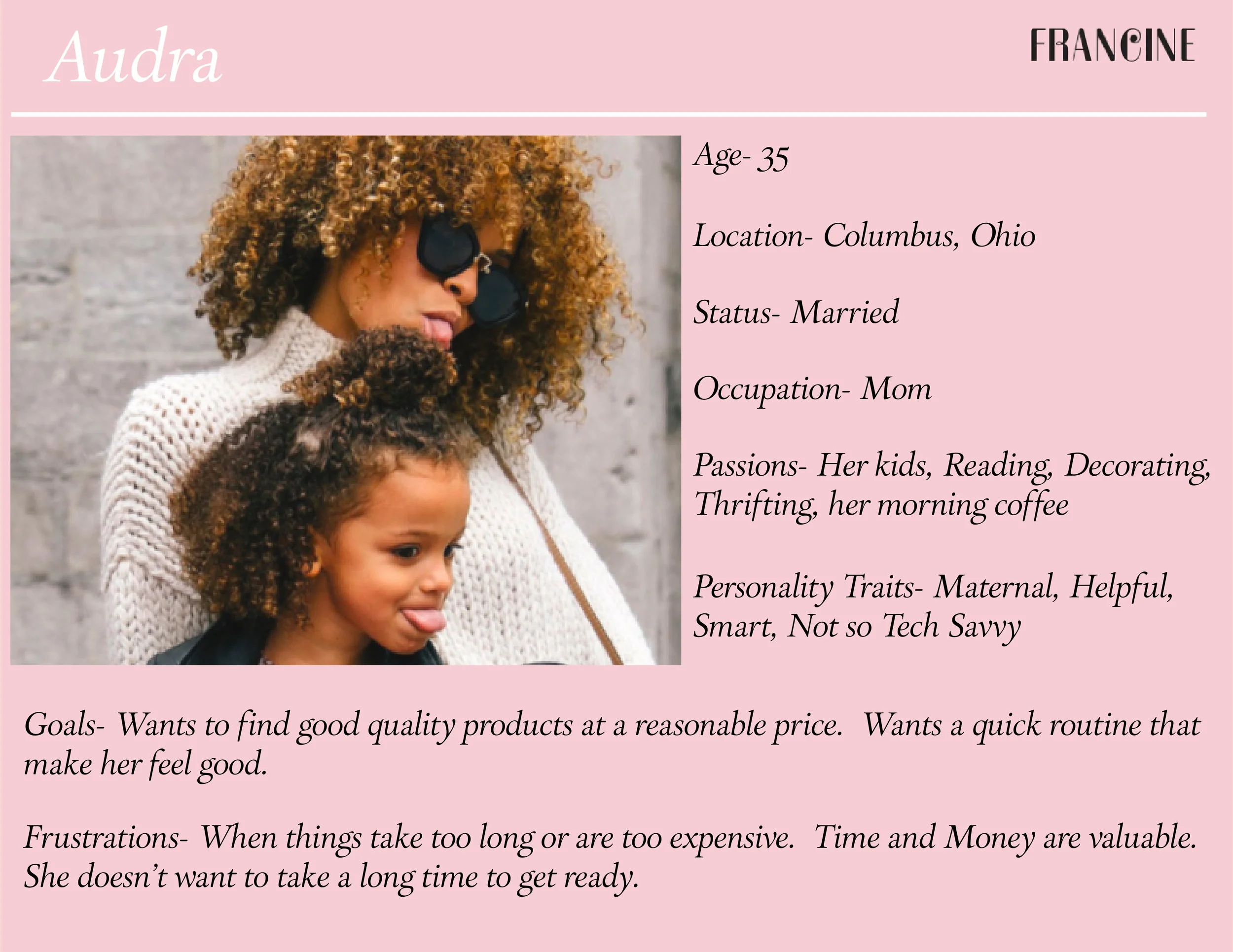
I created a few user personas based on who would be using these sites. There are a wide range of users that we would be designing for, which means this site needed to be easy to navigate so everyone could find what they were looking for.
Information Architecture
I took the topics that we wanted to cover and did a rough layout of the site. I wanted to make sure that there was a smooth flow for the user. We needed to make sure that the user could find what they were looking for and have access to their own personal preferences. Also- most importantly, that people could contact the experts.
The rough layout of the site architecture. I played with the layout of categories and pages to make sure that the users could easily find what they were looking for.
The WireFrames- Low fidelity
I started with some black and white wireframes for the site. I wanted to play around with layout and make sure that everything was as elegant and easy as possible. I used a simple log in page so that people could update their preferences and save stories or a shopping cart. This is not available on other sites. Also this played up more of the social media aspect of this project- people could comment, share their picture, and write their own reviews. I designed the layouts and again met with some users and the creators of the project for feed back.
High Fidelity Wireframes And the interactive prototype- 1st round
Next I moved to the high fidelity wireframes. Things needed to be adjusted as we worked thru the feedback of the low fidelity wireframes, this included color, layout (we added a border for more white space), changed the pink to something more sophisticated, and designed a footer that would make certain features of the site more accessible.
I put all of these screens into InVision so that the users and creators could walk thru the site and see how the screens connect. If you would like to see the interactive prototype click here.
Conclusion- More iterations to come....
After sharing these high fidelity wireframes there is more feedback. I have done some user testing and think we still have a few things to add. I will be updating these designs and this page on my site very soon. We will be adding more awareness to the contact page, adding the instagram page to the menu, and making all of the images pin- able. There are a few other tweaks we will make to help the users navigate smoothly and have a pleasant experience.


